Renovation: House Makeover [Part 1]
/There’s nothing quite like a spectacular renovation to inspire you to transform your own home - and this one is purely captivating . From the moment you enter this stunning home, you will be swept away by the beauty and elegance of each room. From the grand staircase to the sophisticated, over-sized bathroom, no detail has been overlooked.
It has been an exciting journey, consulting, planning and styling this gorgeous home, and the transformation is truly remarkable.
Let us go on a journey . .
Entry Way & Staircase
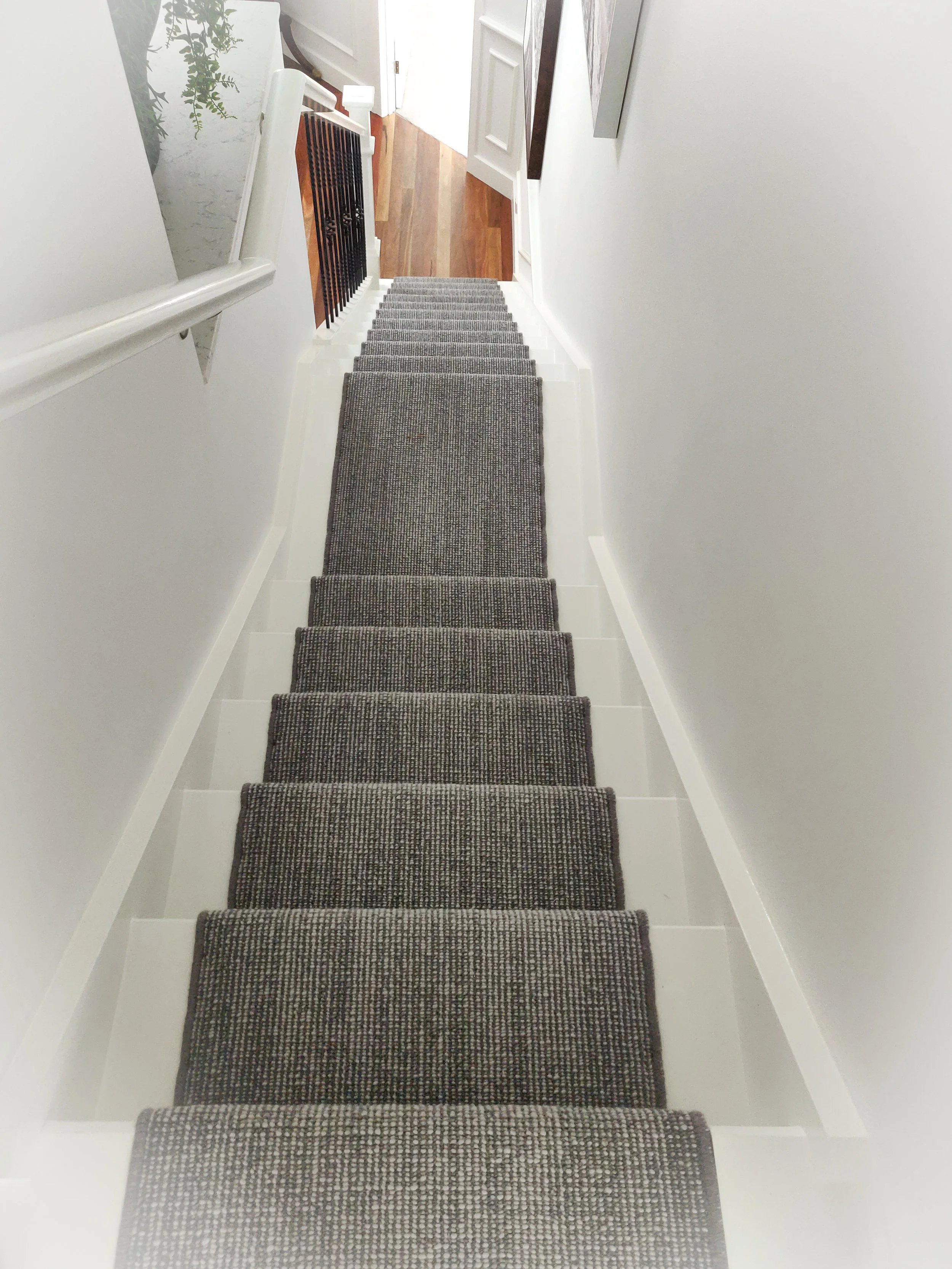
We begin at the staircase. What once was a dark, unattractive space, has been transformed into a stunning, airy, light filled welcoming statement.
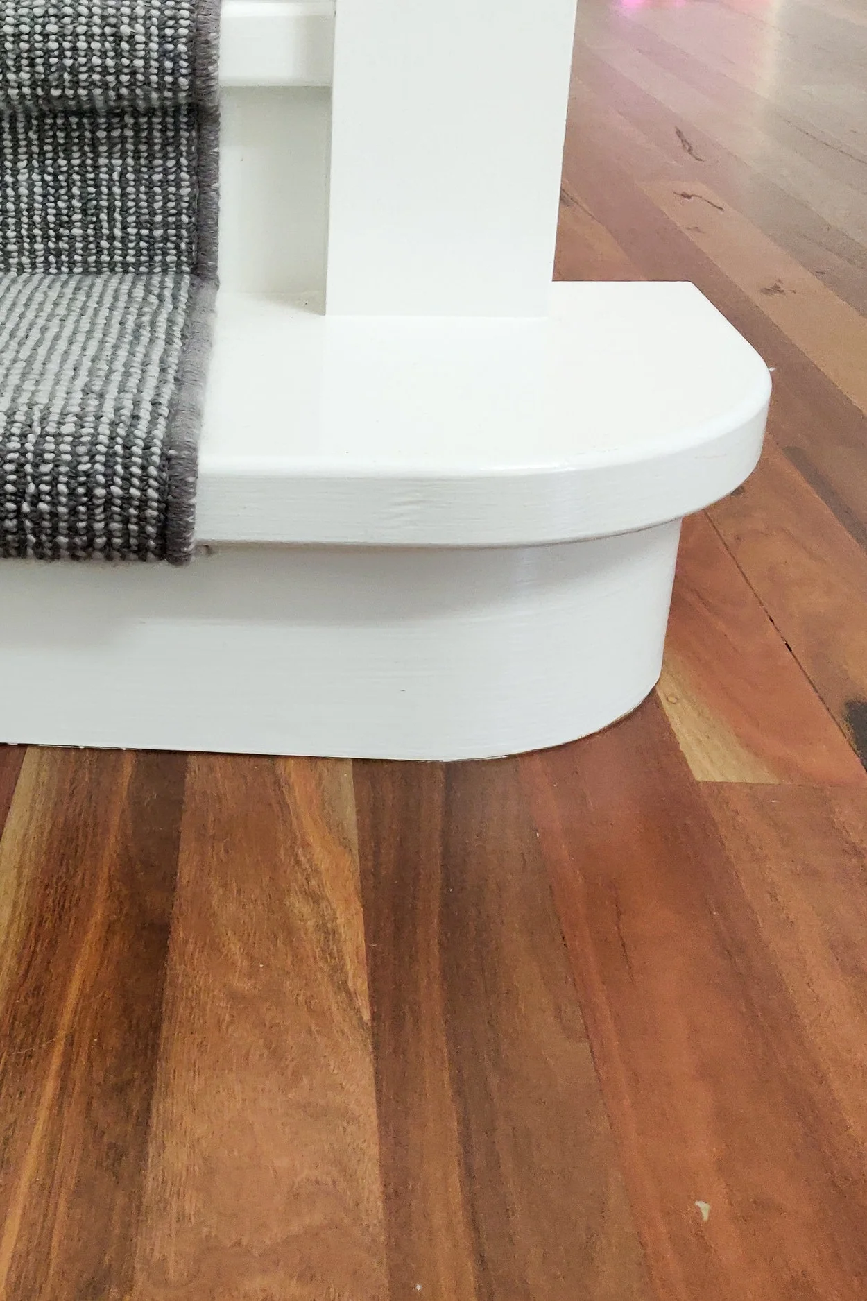
The staircase has been completely rebuilt. The black cast iron balustrade contrasts perfectly with the white stairs and beautiful wool carpet runner from Carpet Court.
Tasteful artwork and custom greenery has brought a soft, fresh touch to this once dark space. The floors have been sanded and refinished to bring a high-end, matte feel and the entire house repainted with feature paneling throughout.
Stairway landing featuring ferns, Cesar-stone and a stunning piece of art
The entry way has been re-painted, finished and styled to be a centerpiece of the house and an inviting welcome to the home. The paint colour chosen for this home is Lexicon by Dulux. This timeless neutral colour was selected for use throughout the home to brighten and open out the space. Lexicon is a great colour option as it matches brilliantly with grays and neutrals, and when surrounded by warm timber, it picks up the warmer colours around it and does not clash or bring out any unwanted tones.
Formal Lounge
The formal lounge was dark with a lot of dated brick work, dark drapes and timber roof paneling with the feature of the room being an out-dated fireplace.
The room was completely overhauled, repainted, re-carpeted and new blinds were installed. The fire-place was rebuilt and transformed into an elegant timeless centerpiece, the hero of the room. Complete with custom mantel.
Stunning custom artwork (from Cooper Black) with blush highlights were chosen to soften the room together with indoor plants and gorgeous textured cushions hand-selected for this project.
The use of textures in this lounge provides depth and warmth - perfect for curling up in front of the fire on a cold Winter’s night.
Formal Lounge Fireplace
Redesign with custom mantle and stunning artwork
Formal Dining
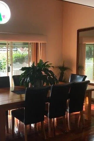
The dining room was quite dark with outdated blinds, paint and dark floors.
The floors throughout were sanded and refinished to lighten up the feel of the house, which this room needed. Window furnishings were replaced and a feature light fixture was added from Beacon Lighting.
A soft, wool rug from Nick Scali under the dining area softens the room.
An art studio was created above the dining room with a window installed to look down onto the beautiful dark wood dining table.
Feature JV Paneling was installed to soften the feel of the room and to give depth and texture that was otherwise lacking.
The out-dated drapes were removed and custom blinds made by Love it Styling were installed to modernise the feel of the room and allow for access onto the patio for entertaining.
* Custom made drapes throughout by Love It Styling
* Custom Artwork - Cooper Black
* Dining Table, chairs and wool feature rug - Nick Scali
* Stair runner - Carpet Court


